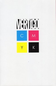
Comic Book Review: Vertigo CYMK edited by Scott Nybakken
Disclaimer: I received this volume from a Goodreads giveaway for the purpose of writing this review. No other compensation was offered or requested.
I don’t talk a lot about colorists. In most comics, they’re not noticed unless they really screw up, or there’s a particularly striking image. But they are an essential part of the color comics creation process. It’s the colorist who makes sure that the characters have the same color clothing and hair from panel to panel and page to page. The colorist has to choose appropriate background colors that will complement the foreground without hurting the eyes, and create mood with appropriate shades for the circumstances. It’s a difficult job and one that doesn’t get the attention it deserves.
The reason I bring this up is because this anthology comic book is all about color. It’s named after Cyan/Magenta/Yellow/blacK, the four inks used in tiny dots to create all the colors in the “four color” printing process that allowed color to work on cheap newsprint paper. For many years it was used both for the Sunday comics and comic books. The latter are printed on fancier paper now, allowing for more shades and variations, but “four-color” is a history that all comics creators know. This was originally a four-issue series with each color getting a focus.
The Cyan section leads off with “Serial Artist” by Shaun Simon (writer), Tony Akins (artist) and Andrew Dalhouse (colorist.) A struggling musician falls in love with a girl he finds “tagging” a building. When he inherited a funeral parlor, he feels obligated to make a go of that instead. His girlfriend has an idea for bringing in some business…he really should have asked more questions about that building she was putting graffiti on.
Many of the pieces aren’t full stories, but mood pieces or story fragments.
One of my favorites is “Adrift” by Jody Houser (writer) and Nathan Fox (artist who did his own colors.) A bereaved girl has a conversation with her little sister’s “Barbara Jean” doll while they wait for her grandmother’s funeral. The doll’s garish magenta clashes with the gray tones around her in a way that emphasizes she’s not of this world.
The Black section tends towards…well, darker pieces, but a couple of them play against this expectation. “Super Blackout” by Gene Luen Yang (writer) and Sonny Liew (art & colors) is about an app that allows you to erase photos on your smartphone–but that’s not its true purpose. There’s some effective use of app icons to carry the story with a minimum of dialogue.
Each section ends with a story by Fabio Moon, who does all the chores himself. They form a connected narrative about a vase artisan and his friend who lose one gallery and go in search of another. The artisan is able to see this loss as an opportunity and sees hope in the future.
While some of the pieces are weaker than others, it’s a beautiful assortment. I should mention that this is a Vertigo “mature readers” title, so there is some violence and nudity, as well as rough language. There are stories that involve suicide and rape, both off-page. (It doesn’t wallow in it like some other Vertigo series have, however.)
I’d recommend this book especially to art students to see how different colorists work with artists and writers to enhance the stories.


That’s quite interesting that comics use the same colors as my printer. Makes complete sense but it’s just something I never thought about. Going to pass this book along to my husband….I think he might be interested in it. 🙂
Once a process works, it’s to your benefit to keep using it until something better comes along.
Oh what an interesting concept for a book. It wasn’t until relatively recently that I even gave thought to the fact and discovered there were colorists. But having become aware of that sent me on a grand exploration of printing processes and then down another rabbit hole of cartooning. Fascinating stuff.
The fun of learning can lead us down many new paths.
How interesting to learn about the C,Y,M aspect of printing. I always wondered why my printer required those. The stories sound really intriguing to me, especially the one about the smartphone erasing photos. Hmmmm….
Gene Luen Yang is one of the better new comics writers out there.